Public Health Institute of WM
Challenge
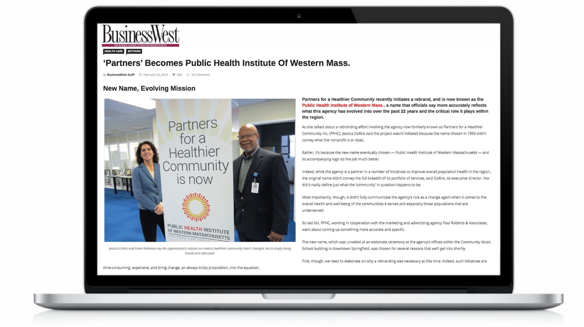
Upon the 20th anniversary of the establishment of Partners for a Healthier Community, leadership determined that a name and brand change was needed. Partners for a Healthier Community had morphed from a small initiative targeting particular public health advocacy to a broader movement engaging more community partners and increasingly engaging in data collection to determine public health strategy. The old brand employed a visual mark of a hand-drawn sun. Also, two other high profile nonprofits in the same region were operating under the name Partners, creating confusion.
result
PRA reviewed data collected by Partners from key stakeholders and community members, determining that the old name did not adequately convey the essence of the organization and its work. The sub-text and de-facto tag line for Partners consisted of reference to the organization serving as the area's public health institute. This essence, and tagline, became the brand and message to the community; an image more in line with its mission. The organization also began to increasingly utilize research as central to its strategies in engaging the public around health. The resulting name and brand where visually represented by an evolved sun, with data bits serving as components of the sun.